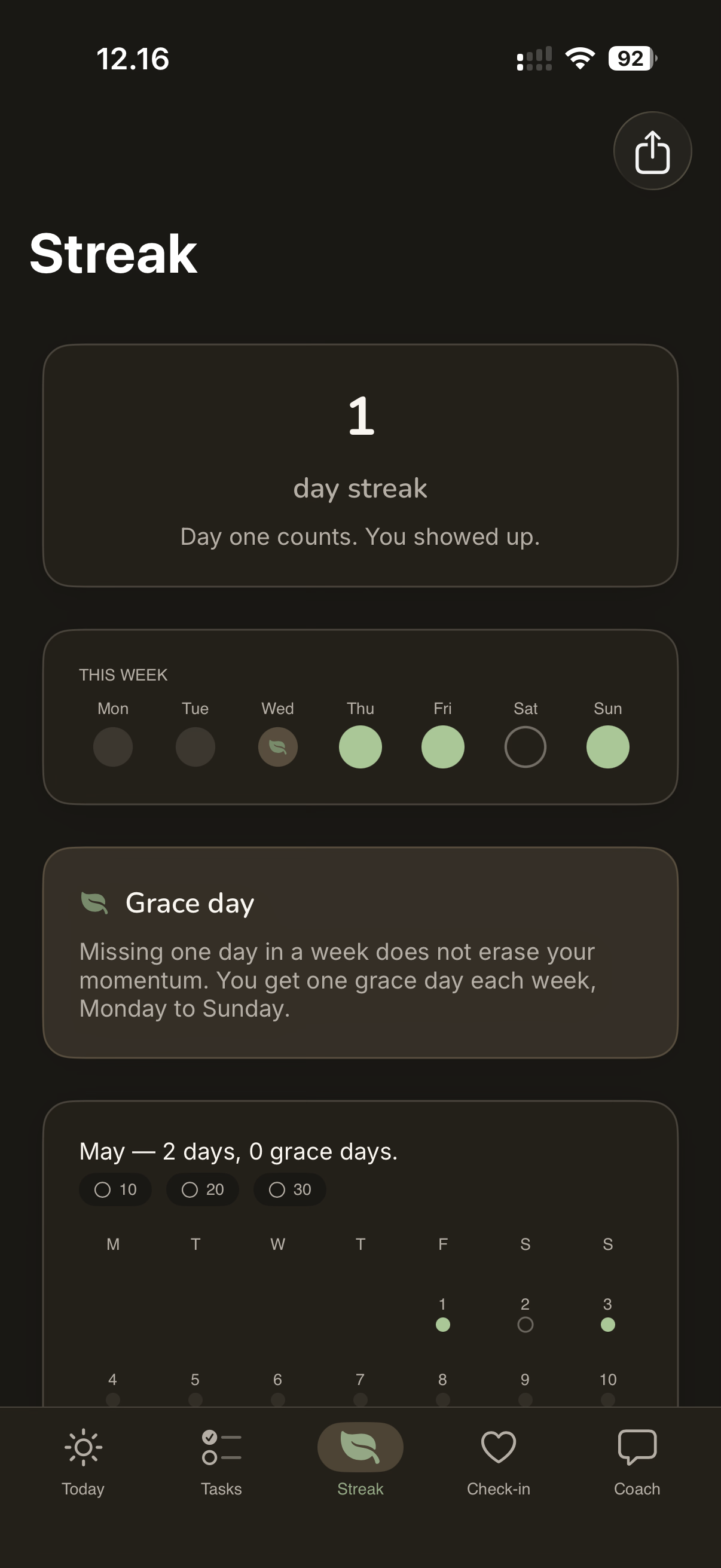
✱ Blazed Labz · est. 2026 One-person studio · Europe

design & code, made by hand.

We're Blazed Labz — apps, tools, video edits, and the occasional weird side project. One thing at a time. Always shipping.

— Selected work · 2020–26 03 / shipped
✱ Today screen · iOS · v1.0

Calm streaks.
No shame.

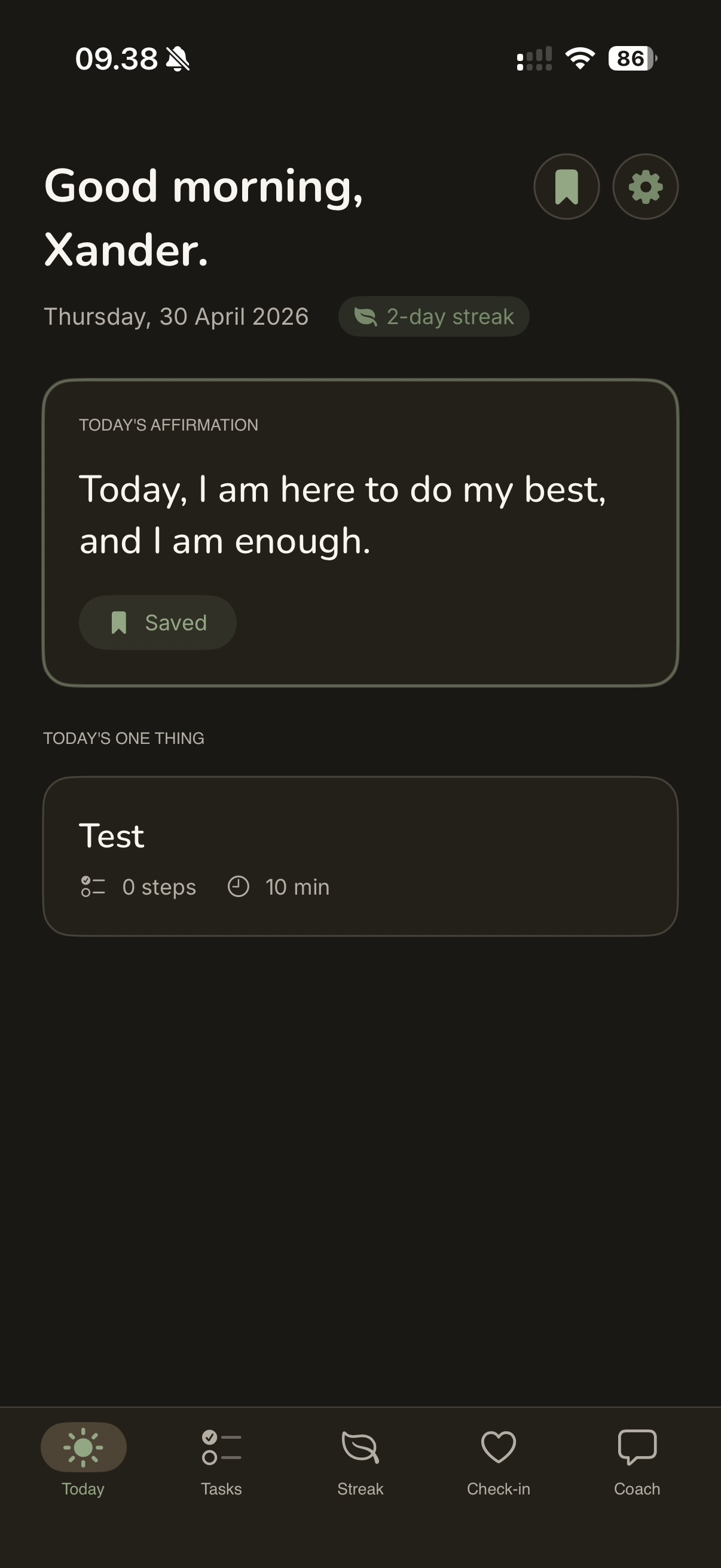
One affirmation. One thing for today. A streak that forgives the missed days. Built end-to-end in SwiftUI.

SwiftUI SwiftData BYO API key
FocusBloom — Today screen
— About this

An iOS app for ADHD brains. Calm streaks, gentle nudges, no shame. Built end-to-end at Blazed Labz — design, code, copy, the whole thing. Shipping to TestFlight June '26.

— Role

Design · iOS engineering · Identity

— Stack
SwiftUI SwiftData On-device AI
01 / case
Blazed Labz · Shipping June 2026

FocusBloomCurrently shipping →

Calm streaks for ADHD brains. iOS · 2026.

Most productivity apps punish you for missing a day. The streak resets, the bar turns red, the shame compounds. That doesn't work for ADHD brains — it makes things worse. FocusBloom is the opposite: a streak that forgives, an affirmation that meets you where you are, and one small thing for today. No shame, no nudges turned threats. Built end-to-end at Blazed Labz — design, code, copy, identity.

Built in SwiftUI with SwiftData for local-first storage. On-device AI for the affirmation generation — your data never leaves your phone.

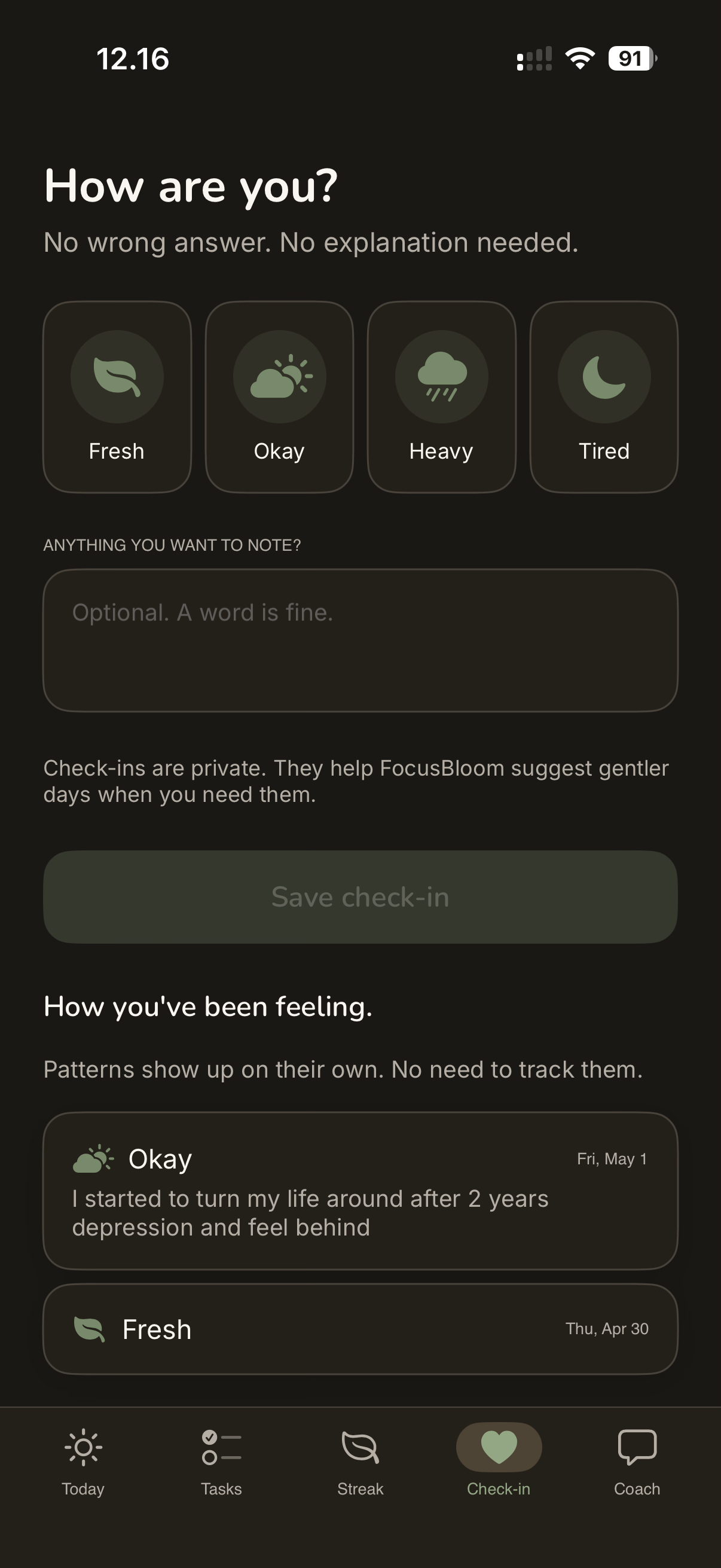
The Today screen is intentionally quiet: one affirmation, one task, one streak. Everything else is one tap away. The check-in flow uses gentle language by design — "How's today going?" instead of "Did you do it?" — because the wording is the product.

SwiftUISwiftDataOn-device AIIn-houseShipping Jun '26
FocusBloom — Today screen
The Today screen. One affirmation, one task, one streak.
FocusBloom — Streak view
A streak that forgives missed days. The shape softens; it doesn't break.
FocusBloom — Coach check-in
The Coach tab. Conversational, on-device, never punishing.

Designing for ADHD brains taught me that defaults are everything. Most apps' defaults assume a neurotypical user with strong executive function. Inverting that — assuming the user might be having a hard day, every day — changed almost every interaction.

Shipping an iOS app from design to TestFlight in-house also reframed what "finished" means. There's no version of this app that's done; there's just the version that's good enough to ship to the next round of testers.

✱ Campaign · Greenpeace DK · 2020

Spark a movement.
Bring a friend.

Two-week real-client brief. Research → concept → motion-graphic video → microsite — funnelling young Danes into Greenpeace's græsrod.org grassroots platform.

Concept UX Frontend Video
GRÆSROD.ORG2020 · DK
BE
THE
SPARK.
02:14 · Film
— About this

A user-centered campaign to inspire young Danes to start grassroots climate movements through Greenpeace's græsrod.org platform. Real client brief, two weeks: research, concept, prototype, motion-graphic video, and a microsite to host it.

— Role

Concept · UX · Frontend · Video direction

— Stack
UCD Campaign Video
02 / case
KEA · 2nd Semester · 2020 · Team of 5

Greenpeace · Spark Movements

Real-client campaign for Greenpeace DK. Concept, video, microsite.

Greenpeace DK wanted to reach an audience they normally don't: Danish teens, 13–15 years old, and inspire them to start their own grassroots climate campaigns through graesrod.org — Greenpeace's open campaigning platform. Two weeks. Real client. No template.

We'd rather join someone else's campaign than start our own.
— Recurring response across 9 group interviews

We went to a high school. Roskilde Highschool, Friday March 6th. Two team members, 9 groups of teens, face-to-face interviews. Phones out. We asked about climate change, campaigns, social media habits, and games.

Then we did something the brief didn't ask for: we borrowed VR headsets from KEA's tech lounge and ran usability testing with Greenpeace's 360° campaign videos. The teens loved it. The novelty pulled them in; the content kept them.

9 groups18 students1 VR headset5 hypotheses

The campaign mechanic: Instagram meme ads drive teens to a microsite. A world map is the primary navigation — click a region, a 360° Greenpeace video opens (watchable with or without VR). After watching, a meme appears with a CTA back to graesrod.org to start your own campaign.

World-map landing — hi-fi prototype
The microsite landing. Click a region to open a 360° video.
Climate-strike footage from the campaign archive — the kind of energy we were trying to channel.
Greenpeace · Spark Movements — style tile
After the video, a meme. After the meme, a call to action.

Real client briefs change everything. Research stops being theoretical; the people you're designing for are 13 and tell you exactly what they think. The target audience was younger than Greenpeace usually targets, which meant their existing campaign playbook didn't apply — we had to build something from scratch in two weeks.

Testing with VR was a gamble that paid off. It wouldn't have shown up in desk research as the "right" channel, but watching teens fight for the headset told us more than any survey could.

✱ Travel guide · KEA T7 · 2020

Pack light.
Go far.

A multi-page travel guide for young backpackers heading through Denmark, Norway and Poland. Full UX process — research, wireframes, style tiles, BERT testing, brand identity. Built in a team of four for KEA's 2nd-semester final. Deployed live.

UX Brand Frontend Group
HOME·CONTINENTS·TIPS
Wanderlust
Start your
journey
DK · NO · PL · GITHUB.IO · 2020
— About this

A multi-page travel guide for young backpackers heading through Denmark, Norway and Poland. Full UCD process — Business Model Canvas, persona research, flowcharts, wireframes, three style-tile rounds, BERT emotional-response testing, expert review and think-aloud usability tests — wrapped in a custom brand from scratch. Built in a team of four. Deployed live.

— Role

UX · Brand · Frontend · Group of 4

— Stack
UCD Web Brand
03 / case
KEA · 2nd Semester · 2020 · Group project

Wanderlust

A travel guide for 18–25 backpackers. Built in a team of four.

KEA's T7 final assignment: build a website around something the team has in common, end-to-end. Research, brand, frontend, testing — the lot. We chose travel. Specifically, backpacker travel for an 18–25 urban audience: Denmark, Norway, Poland. JSON-fetched content, multi-page, deployed live. Four people, one repo, 129 commits.

Full UCD process, by the book and then some. Business Model Canvas → personas → flow charts → wireframes → three rounds of style tiles → BERT (bipolar emotional response testing) on the style tiles → first prototype → expert review with the teachers → second iteration → think-aloud usability test → final.

The brand was developed from scratch — handwritten Wanderlust wordmark, backpacker silhouette mark, deep teal-to-coral sunset palette. Style tiles were tested with the target audience using BERT bipolar scales (Modern–Old Fashioned, Friendly–Intimidating, Adventurous–Safe). The winning direction informed everything downstream.

129 commits4 teammates3 countries7 templates2 iterations
Wanderlust — homepage hero
The homepage. Start broad, narrow by interest.
Wanderlust — country page
Country pages with activities, flights, accommodation, and local tips.
Wanderlust — winning style-tile direction
Three style-tile directions. The third — teal, peach, sunset textures — won the BERT round and shaped the final brand.

Group projects are 30% craft and 70% process. The Trello board, the shared Figma, the daily standups — none of that is glamorous, but it's what kept four people aligned across two weeks of iteration.

BERT testing changed how I think about visual design. We had three strong style tiles; without testing we'd have picked the one we personally liked. The audience picked a different one — and they were right for this audience.

— About
Alexander Nielsen, portrait that's me ↗

Multimedia design graduate.
Indie studio of one.

I'm a multimedia design graduate from KEA (2022) running Blazed Labz — a small European studio building apps, tools, and video edits. Design, code, writing, the late nights. Sometimes that means slower. Mostly it means weirder.

I like type that earns its size, motion that has a reason, and interfaces that don't apologize for being opinionated. Currently shipping FocusBloom, an iOS app for ADHD brains.

— Education

AP Degree in Multimedia Design & Communication
KEA · 2019–2022

— Design

Figma · Sketch · Adobe XD
Photoshop · Illustrator · InDesign

— Build & AI

HTML · CSS · JavaScript · Swift
Cursor · Claude Code · Claude Design
After Effects · Premiere · Final Cut

— Open to

Internships · freelance · collaborations
DK · EN · remote

— Contact

Got a weird
idea? Send it.

I'm open to internships, freelance, and collaborations on the stranger-than-usual end. I read every email. Reply within a day or two.

no spam, ever